New Climext graphic charter, a new step in our evolution.
We tell you everything.
2025 marks a turning point in our history. More than a change of logo, it is our whole visual identity that we have redesigned.
Why this choice? Why now? And above all, what does it change (for you, for us)?
Here are the reasons behind the new Climext graphic charter. And you will see: it's much more than a makeover.
Evolution
A brand that evolves, an image that follows
For more than 15 years, Climext has designed and manufactured high pressure misting systems for pros.
Today, we are aimed at:
● industry, agriculture and food with the Process range,
● communities and CHRs with the Project range,
● and even individuals with our EDEN range
In 2024, a new CAP was crossed: new management, new ambition, same requirement. It was time for our image to reflect this deep transformation.
A rethought logo for more impact (and more sense)
The old logo has accompanied us for years. He had had his day. The new Climext logo is:
● More daring, more readable,
● Built around a tailor-made typography,
● Designed to work everywhere: web, print, products, social networks ...
It embodies what we have become: an innovative, solid, technical company, but with a real concern for readability and clarity.
And above all: it marks our singularity, while remaining simple, fluid, immediately identifiable.
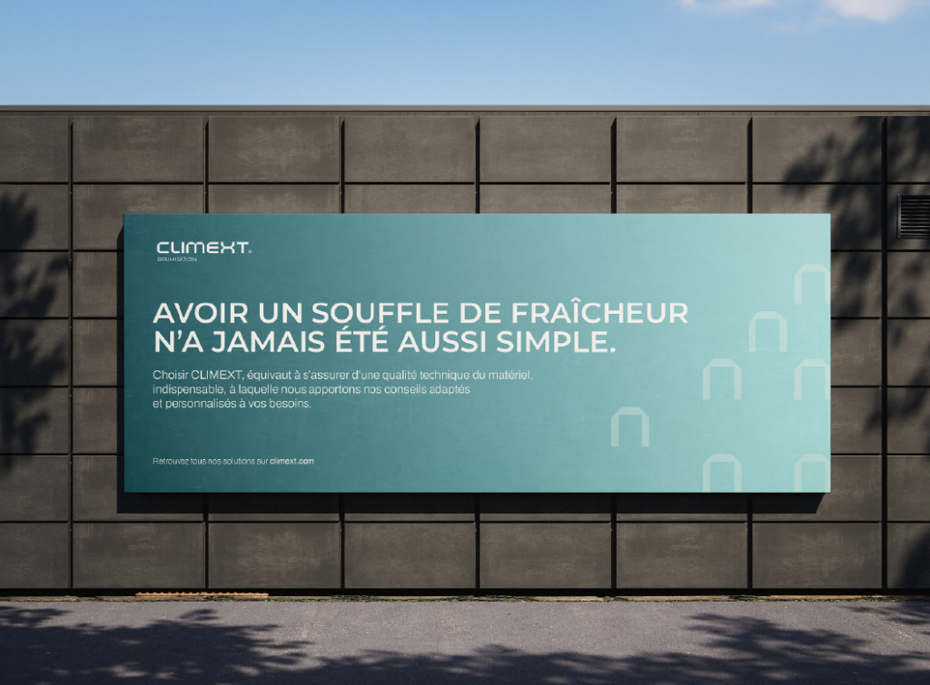
A new graphic charter for total consistency
Our new Climext graphic charter does not stop at the logo. It is a complete visual language, designed to embody our values and our ambitions.
Pallet of redesigned colors
finished the blues “already seen”. Make way for a modern, fresh and structured palette:
● Midnight Green: our technical anchoring, our solidity,
● Light Blue & Celeste: the freshness of mist, the feeling of well-being,
● Peach & Orange: energy, humanity, relational heat,
● Gunmetal: industrial rigor.
These colors are not there only to “make it pretty”. They translate our ranges, our uses, our audiences.
Visual element
An emblematic pattern
We have joined our new identity a modular graphic pattern, inspired by the diffusion of the mist.
This pattern:
● adds a strong visual signature,
● structure our supports (web, print, events),
● reflects our profession in an abstract but elegant way.

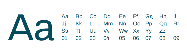
Font
An assertive typography
Arial or roboto finished. Welcome to Montserrat for titles: elegant, structured, modern. And in Archivo for the current text: fluid, sober, readable.
A duo designed to mix technical and accessibility, serious and proximity.
Future
An identity turned to the future (and international)
This new Climext graphic charter is also a tool for:
● To assert our positioning: technical, innovative, sustainable,
● Structure our ranges for more customer clarity,
● accelerate our international development with a strong, consistent, impacting identity.
In summary
A modern, impactful, coherent logo
A graphic charter thought to last
Colors, typos, a pattern that makes sense
An image up to our know-how
A visual promise for you, our customers
Do you like our new identity?
Find out how our expertise can refresh your projects.